The thin line of customer satisfaction – or how to turn good into bad

Sometimes it is surprising how easy it is to turn a good idea into an unsatisfying customer experience.

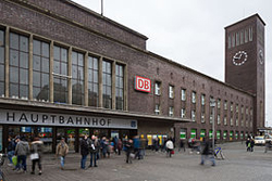
A few days ago, Bbcause I wanted to be on the safe side I had booked a train with a 2 hour time window after a meeting. Surprisingly the meeting ended on time so I was at the station very early.
I had booked a super-saver ticket which is bound to a specific train, so my first question was whether there is any way to upgrade it or pay for a change of train. This already was a 2 step process, because the Information booth I learned, is only there for Information and my question whether there is an upgrade possibility does not qualify as information and I needed to go to the ticket counter (limited bad customer experience part 1).

There the quick answer was no. There is no way of changing the ticket – I could only wait for the booked train or buy a new ticket (limited bad customer experience part 2). Also not sure why most airlines can offer such a service.

After walking around for 45 min in search for a coffee and a restroom and killing time, I remembered that the Deutsche Bahn (german railway) had started to have lounges in major train stations, which are open for 1st class ticket holders and loyalty card holders. As I normally book first class with super saver I was actually eligible for lounge access.

And indeed they have a decent lounge at the station (big bad customer experience part 3 – because I had to figure it out myself). The good idea of lounges at stations actually turned bad for me.

So had anyone of the people in the process – which we tend to refer to as touchpoints – bothered to ask which kind of ticket I have and that I could wait in the lounge for my train, this could have been an exceptional customer experience. But now it is another example in my long list of how things can easily go wrong with customers.

And the line between bad and excellent is extremely thin in customer experience.

What if people are not incentivized to answer questions and perform their duty, but to improve customer experience?

Is Data the Oil or the Currency?

Lately I have seen again the notion that “data is the new currency” and similarly „data is the new oil“. We are quick to put out these metaphors because they seem to illustrate the importance of data in business today.

But there is a fundamental difference between oil and currency as a model for what data is and this difference is sometimes lost in the discussion.

Oil is a limited resource that only can be found in some places. Whoever gets his hand on these places first or who happens to own the land (or the country in some cases) that oil is found on gets all the benefits from the oil. A fact that many middle east countries have been living on nicely.

While currency is also a limited resources, at least to some degree and with economic consequences when too much is created, it has a number of important features. The functioning of a currency is based on transparency: the value is visible to or can be determined by everybody and availability: everybody can acquire it at an agreed value.

Going through this description than data today is more like oil, where a few companies, by virtue of their business model, their execution excellence, their right time to market have gained access to a lot of data.

Data today is not transparent and tradable like a currency. While people may trade their personal data for free applications involuntarily, they can not determine the real value of their data. And data can not really be traded openly or actively. A lot of companies have created an infrastructure for themselves to sell data and the holy grail of many companies and new business models is created around such an infrastructure. But those people that provide the data for such business models are not involved in the creation or control of those systems.

Whether this will change in the future or data will always be stuck in the „oil corner“ of the metaphors is to be seen.

Fitbit vs. Apple Watch or Solution vs. Platform

Beginning of December market research company IDC released their market numbers for smartwatches and fitness devices (the summarize is as wearables) with fitbit leading the pack with a strong 23% while the Apple Watch only makes it to place 4 with 4.9% (here)

I found this quite surprising, but can now add a personal view to it.

For the last year I have been wearing and using a fitbit charge HR – as a fitness tracking device and to a lesser extent as a watch. The watch functionality is really very limited, especially as I switched off the “switch on by turning your wrist“-feature. I find this very annoying in the night and I don’t like switching off the feature every night. Also because it can not be done on the device, but requires syncing with the phone. Maybe someone could put a feature request in to sync the feature with the sleep detection. The major drawback of the fitbit, however, is that it looks pretty ugly.

But for some time I also wanted to try out the Apple Watch. Mainly because it is a nicer „watch“ combined with a different flavor of fitness device. So now I have been wearing an Apple Watch for a few weeks. And I have to say the experience is somewhat disappointing.

On the positive side, I still have the “turn on by turning your wrist“ feature switched off, but it is way easier to tap on the Apple Watch screen to get the time then on the small “screen” of the fitbit. Although admittedly the new fitbit charge 2 has a bigger display and I have not tried the fitbit Blaze.

The largest disappointment, however, was the fitness and health functionality. Especially as this has been the major taling point for apple through several keynotes. On the fitbit you have the watch and a single app that compiles all the information into one simple screen. At least the information I am mainly looking at: heart rate – across the day, sleeping pattern and training sessions and the floors I climbed. The fitbit automatically detects training sessions and detects sleep and sleep pattern with surprising accuracy. And the fitbit app also serves as the main configuration tool for your device. On the Apple Watch you are first left with 3 different places to configure the fitness functionality: the watch itself, the watch app on your phone and the health app. Very confusing and difficult to understand which part is configured where. The health app itself only provides a very limited functionality in itself and relies on other applications to provide additional data.

The first thing I looked at was sleep tracking. Enthusiastically I invested money in 2 apps only to find that they do not automatically detect sleep, but I have to explicitly start them or indicate that I start sleeping (as said the fitbit detects this automatically and reliable, even for the short power nap after lunch :-).

The next thing that my fitbit did automatically was detecting floors I walked up. My combination of Apple Watch and iPhone does not do this, but the Health app only receives data from the iPhone, i.e. when leaving the iPhone at the desk the stairs I climb are not counted. Maybe this is a configuration topic, but going back to the previous point I have not managed to do this appropriately.While the heart rate monitoring is provided automatically the information value of the provided graphic is rather limited.

And overall the Health app looks very overloaded and lacks nice, simple look of the fitbit app. For example the introduction videos in each section of the Health app are very much out of place within the app.
But through all this I came to the conclusion that Apple Watch and fitbit have a fundamentally different approach to smartwatches and fitness tracking. While fitbit provides a complete solution with a well thought trough application to accompany all the functionality of the fitness device, the Apple Watch is just a platform or framework for creating an ecosystem of many different applications. This is inline with the experience and approach Apple has used for the iPhone and is also now trying in the Apple TV and tvOS.

However, in todays implementation this leaves the user with a lot of cracks in the user experience and way less satisfying than comparable fitness devices. I also understand that the capabilities of the Apple Watch are way beyond what today’s fitness devices can deliver and there are probably also battery considerations that make some solutions not feasible, but I don’t see any technical reason why you can not create a seamless health and fitness user experience on the Apple Watch. It appears that Apple tried to achieve too much with their first release of the OS and app (well actually the third by now)

Maybe I will learn to love my Apple Watch the same way I do my fitbit (which now gets to rest for a while).
Corporate Culture – Seeing the Iceberg

Dave Gray - PresentationCorporate Culture is an interesting, important, influential, but hard to capture topic. Dave Gray did a great job at the Dare Conference 2013 – with the presentation now available here – talking about Culture and Change and introducing his Corporate Culture Map tool.

What I find especially intriguing and interesting is the reversed top-down approach – well you might call it bottom-up. But it starts with the Values, which almost every company has outlined in some form and which are normally delivered top-down, although in the corporate culture map they are actually somewhere at the bottom. The exercise is to take these Values and work your way up to the Evidence. This can happen in two forms: (1) looking at real world evidence that support the Values, but more interestingly (2) to define “Evidence”, i.e. behaviors that you would expect to support the Values and which would also be rewarded in the organisation.

Turning Values, that tend to be rather generic, into better defined actions, will help in any attempt to promote or change a specific corporate culture.

IxDA Munich: Holistic User Experience

We had a great IxDA Munich event tonight hosted by designaffairs in their new office. Claude Toussaint presented designaffairs concept and approach to Holistic User Experience (HUX)

Designaffairs has identified 21 factors that are important for product design. But using the standard Marketing approach and asking customers which factors they value as most important, the normal result is that all factors are clustered very closely together in their rating. So the questions is how to determine the factors that are unconsciously really driving product decisions.

Instead of asking the customer about what they think is important they turn around and ask them about their existing product. The products performance against the 21 factors is evaluated. They then use a multi-regression analysis to identify the importance of the different factors.

This approach enables them to have a qualified analysis on what factors are important for customers. One example they did was evaluating washing machines in the USA. It turned out that the brand is not an important factor in the purchasing decision. And in the design process the collected information is used to prioritize investment decision.

It was very interesting to see an analytic approach to evaluate customer needs, requirements and preferences. Although this approach is not suited to evaluate innovations because it only works with products already established in the market it sounded like an excellent basis for any design project. With an adaptation of the relevant factors it could also be used for service or digital product design.

Design Thinking: The Wallet and Mastercard

Mastercard announced to release a next generation display card in Singapore. The interactive payment card has a built-in display and touch sensitive buttons.

This plays very well with two design thinking activities I had during this summer.

The Xing Design Thinking Group Munich had a great event in July at the Strascheg Center for Entrepreneurship

Florian Huber, who is managing the ape program at the SCE gave a very interesting introduction and then it was do-it-yourself. We all did a practical Design Thinking exercise in redesigning the wallet. In pairs we reflected on, i.e. tried to understand, customer needs and requirements for the wallet before we started the design and prototyping work. A lot of fun with pizza and beer

And then on August 1st, Daniel Bartels transformed combinat56 coworking space into a Design Thinking lab. He gave an introduction into Design Thinking before again everybody jumped into the Redesign-the-Wallet exercise.

Besides the great introductions into Design Thinking, doing the same exercise – redesigning the wallet – with a different partner in a different setup was a very special experience. Each round brought great insight, but very different solutions and designs.

But now coming back to the Mastercard initiative. The last design was based on the idea that the main purpose of the wallet today is to carry different cards (credit cards, payment cards, passports, driver license) around. So why not combine all those into a single multi-purpose card and make that the key component of the next generation wallet. The same form factor as today’s credit cards, hosting a programmable magnetic stripe and embedded chip that can emulate any other real credit card. And a screen to manage the different identities of the card as well as to display other information, like pictures.  Additionally there would be a programming device that would copy all the other cards into this single multi-purpose card. Not sure about the technical feasibility of the design, but it sounded like a pretty cool device.

Why would this be better than a smartphone with NFC and the corresponding wallet application. Well as long as the credit card is the form factor that works at any point of sales it is just easier to have something that behaves as a credit card with the flexibility of a smart device.

Maybe Mastercard just released version 1.0 of our wallet design.

Know Thyself: Customer Privacy everywhere, or NOT

Today – or actually yesterday – seems to be the day where everything comes together on customer privacy

1 – Some lengthy discussion (at TheNextWeb and iMore) about Verizon’s (and other mobile operators) opt-out setting for monitoring and sharing of detailed information about smartphone users. The whole issue coming in two different flavors: (1) that operators monitor and share those data at all and (2) the very hard to find opt-out – rather than an opt-in – process.

And as a sidetrack to this, Telefonica (totaltelecom) launching it’s Big Data endeavor called Telefonica Dynamic to make money out of customer data.

2 – In parallel arstechnica had a story about Privacyfix a new privacy monitor that attempts to calculate your value on the net for Google and Facebook. I’m not really worth much according to their analysis.

3 – then the zdnet report on the fruitless discussions to find an agreement on the Do-not-track (DNT) feature in the W3C standardization body.  The whole issue driven by the Microsoft’s decision to enable DNT as the default in IE10, thus preventing tracking unless the user actively enables it.

And finally, I just finished reading Charles Duhigg’s “The Power of Habit”.
Retail stores like Target (the name says it already) identifying pregnant women only by monitoring their shopping behavior, gives you a sense on what is possible with consolidated customer information.

Privacy and implications of increased awareness on protecting your own data is definitely something to monitor for the future.

The Tale of Two Designs / Cities (Bus vs. Cab)

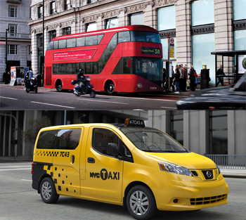
Just coming back from a trip to London with its shiny new busses I was reminded of an article I read in a local newspaper (sorry no link available) recently about the design of the new New York cab or the Taxi of Tomorrow as it is called (see here).

The article (as well as this report in Metropolis Mag on the unveiling of the new taxi)  stressed that the needs and wishes of taxi drivers and passengers have been put above the aesthetic appearance. And thus creating a car that misses the iconic presence of it’s predecessors of the Ford Crown Victoria or the Checker cab.

Now compare this to the redesign of the London Transport Bus, replacing the aging and no longer manufactured Roadmaster double-decker bus.  The design was driven by renowned Heatherwick design studio. And while it was faced with similar design criteria, like fuel efficiency, ease of access, etc. as their New York counterparts, they managed to not only come up with a functionally appealing concept,  they also created a beautiful design.

Here lies the great art of design. Combining the needs and wishes of users with an aesthetically appealing form.